LondonAirquality Analysis with IcCube

If you do analytics, you probably usually go straight for Python Notebooks, and create a bunch of graphs to visualize the analysed data.
When you don’t want to show that data to someone outside, and hide implementation details, a nice alternative, and my de facto favourite, is to go and use IcCube.
As an exercice, I was teaching how to get ready and graph quickly with IcCube, using air quality data.
For the data, the UK government is hosting a large amount of data sets free of use, aggregating various data on London.
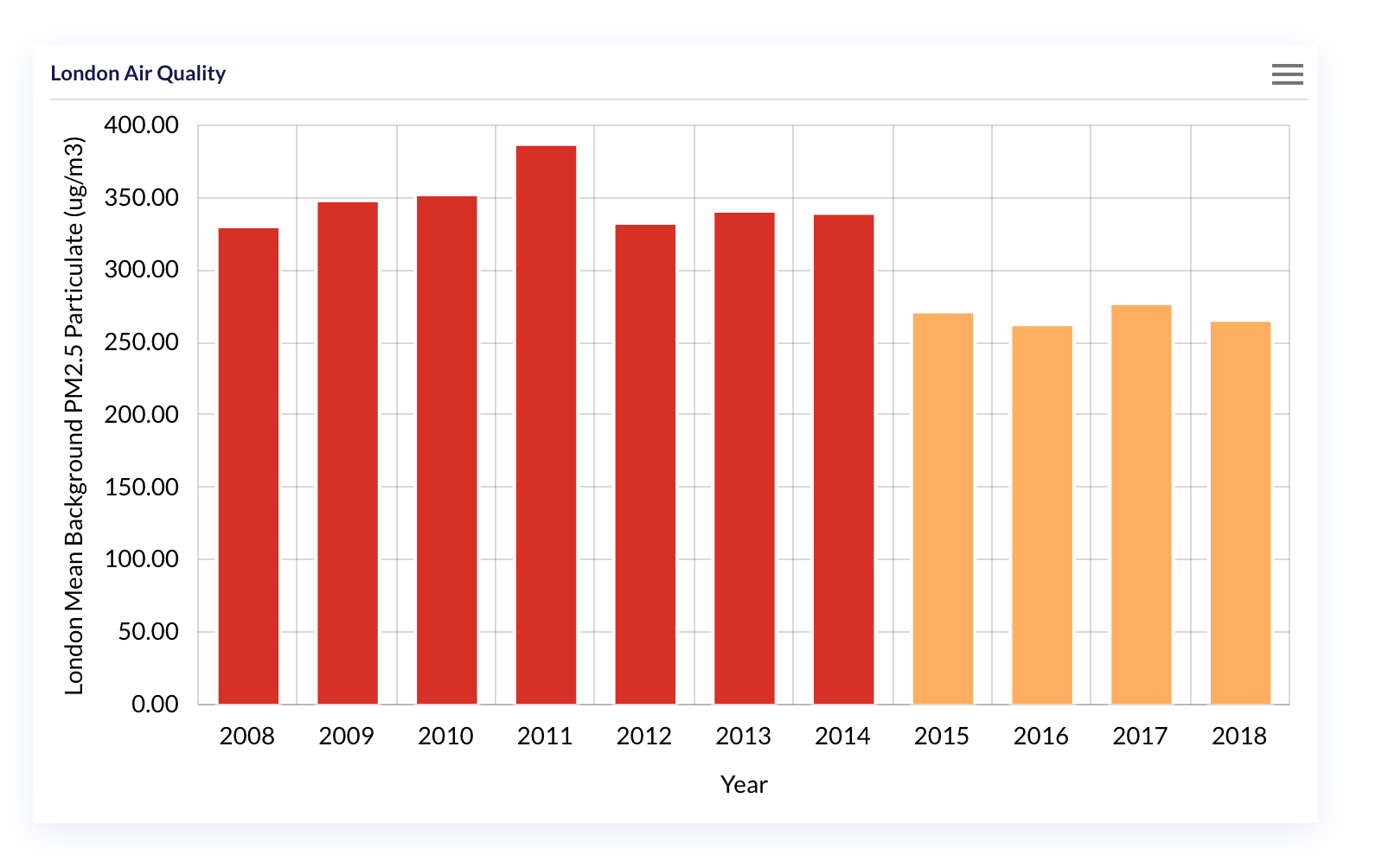
In the scope of this post we will focus on the London AirQuality over the last 20 years, and do some reporting on that data.
The goal of this post is to get your through a quick tutorial on how to do a data analysis of London Air Quality using iccube running on docker, in 15 minutes!
If you don’t have IcCube running locally, first let’s start a server on your machine.
Starting IcCube on a docker instance
IcCube has released a docker image (that runs on arm64!) that is ready and free to use for basic usage.
A new iccube image has been released, running on a large set of hardware, and we can start a container with a simple bash command. (supposing docker is running on your machine here, if not, go ahead and get docker)
The command to start the container is:
docker run -d --name icCube-community \
	--restart unless-stopped -p 8282:8282 \
	ic3software/iccube:8.2.2-chromium
Once the command has finished, open a browser and head to: the iccube admin page and log in with defaults user/password admin/admin.
Developping with IcCube works in two steps:
-
Fetch and prepare the data: this task involved a mix of settings where to fetch the data, enhanced the data with transformation, aka ETL, settings the hierachies to perform Drilldown, and creating Measures, or data that is computed/sliced depending on the requested hierarchies and aggregation parameters.
-
Reporting: Which is mostly, turning the data in shapes, visualizing along adapting to user interactions.
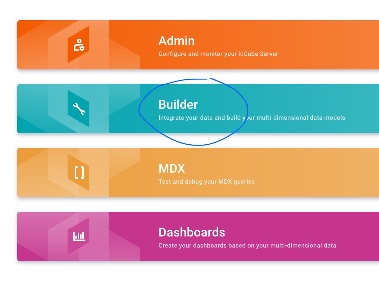
As a first step, let’s head to the Builder section and massage our data to prepare it for reporting.
Preparing the IcCube schema
Data definitions in IcCube are stored as schema. We start by creating a new schema using the button below:

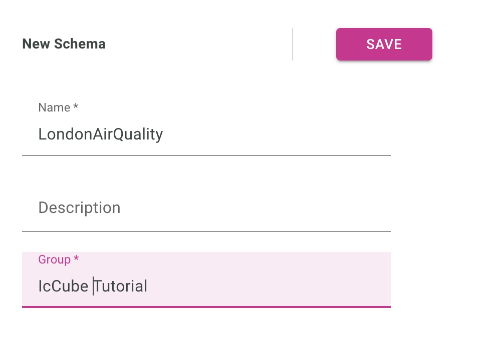
And let’s input the basics of our schema name and group.
After pressing Save you now have access to four blue squares, which pretty much lay the path to the different steps of the data preparation.
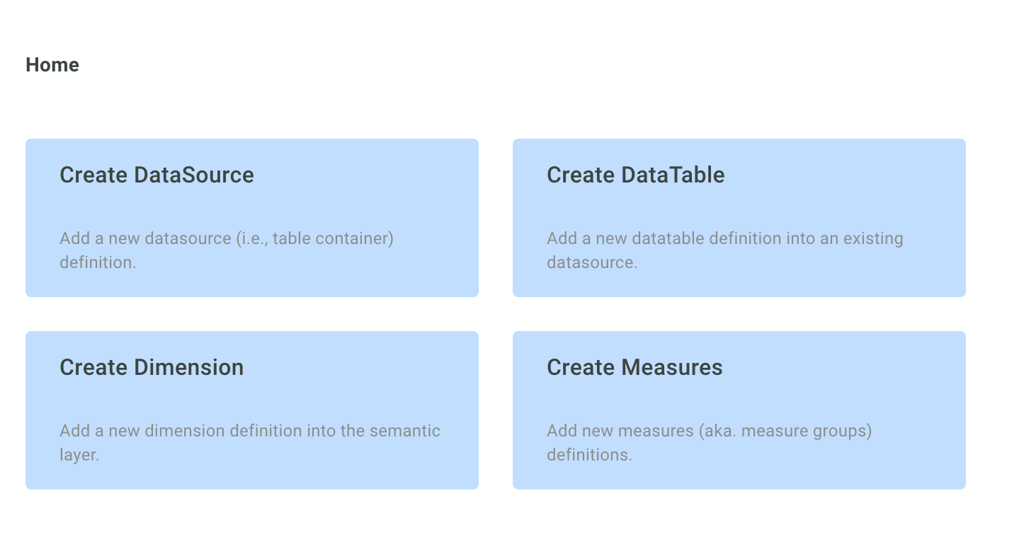
Create the data source
The data source defines the type and the location of the data.
Here we want to access a single CSV file hosted on a remote HTTP server.
The full path to the CSV file is: https://data.london.gov.uk/download/london-average-air-quality-levels/1d9847eb-56ac-4168-9e74-93609fcee134/air-quality-london-monthly-averages.csv
In IcCube, whether a local folder or a remote URL, you split the path in two with:
- a base folder, and
- a (set of) table(s).
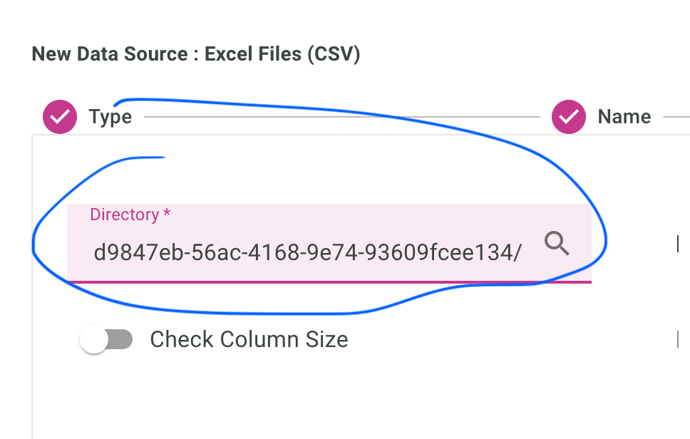
So the path for this data source will be:
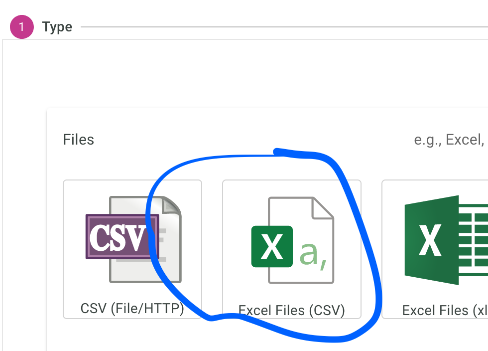
So first, select an excel/csv data source:
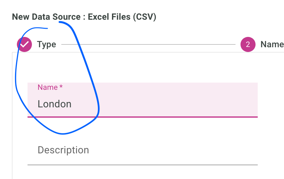
Give it a name:
Enter the directory, so the first part of the URL as we have just seen:
Now, let’s create the data table.
Create the data table
You can head straight to the Create Table section either after saving the data source, or pressing the + button in the data table section in the iccube menu.
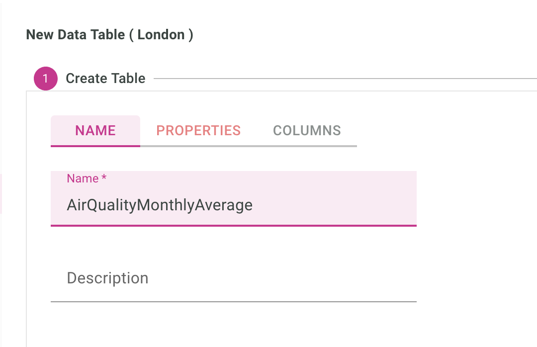
Let’s give it a name:
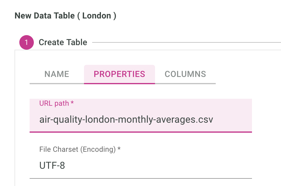
Enter the just the file name of the csv file:
And if you check on the data, you will notice the dates are in the format Jan-08, Feb-08 etc.. which we will ask IcCube to parse from us using the date format parsing MMM-yy:
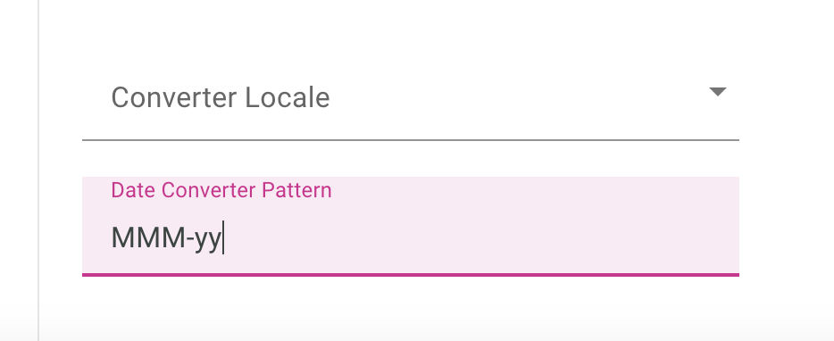
Table is created after you press save, so we can now :
- browse its content, and
- enter the settings.
Content of the data table, (so same as the CSV file) can be accessed via the menu below:
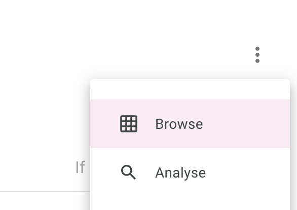
Then we need to do a bit of work on the data type definition.
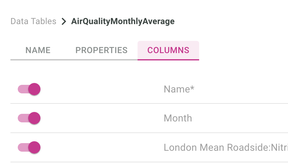
- Month column will be a date, formatted along what we just setup in the screen before
- London Mean Background 2.5 has some typos in the data, so we’ll just turn it off for today
- All the other columns types will be set to floats.
This is how to disable loading data from the London Mean Background PM2.5 column:

This is how to set the types of each columns according to what we have decided above:
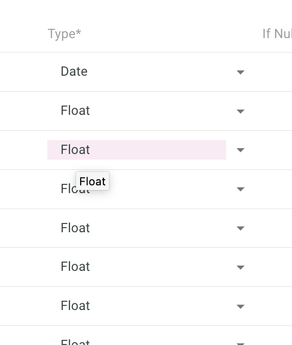
Note that if you load data from a database, types would be automatically loaded from the database schema.
Click the save button and now let’s head to the semantic layer where we define the dimensions, ie, how we want to drill down inside our data.
Create dimensions
Dimensions is how you can view your data top down.
For sales, you could have: Continent -> Country -> City
so for example: Asia -> Japan -> Tokyo Europe > France > Paris
When analysis data, we also do a lot of time series, so: Year -> Quarter -> Month -> Day
Could be the hierarchy of your Date dimension.
In our present London example, we create a time hierarchy to drill down per Year -> Month.
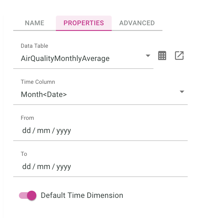
First, we select the type Time for the dimension:
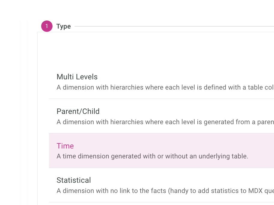
Then setup the Name, Data Table, And the column:
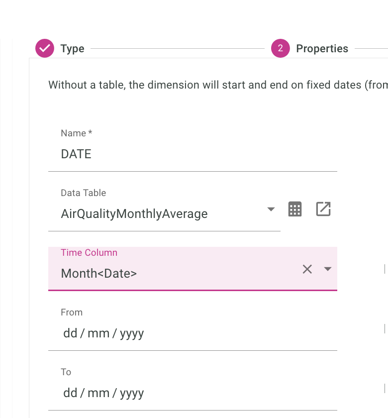
Finally, we should which levels we want to have:
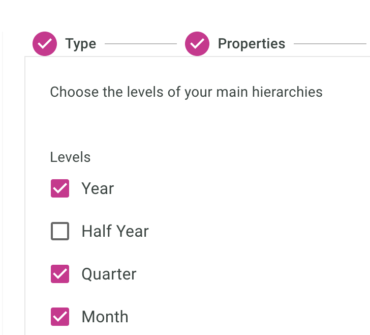
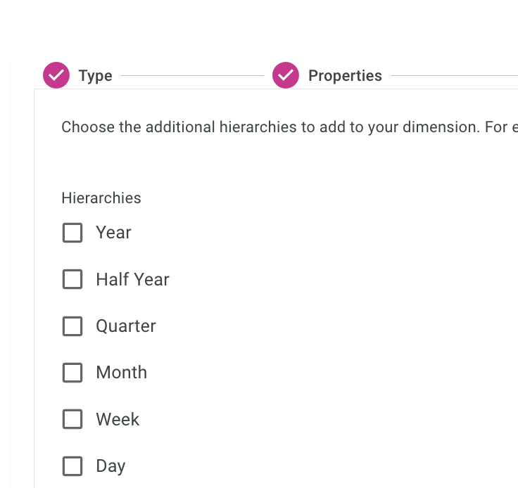
As a start, we only want one hierarchy in our Date dimension
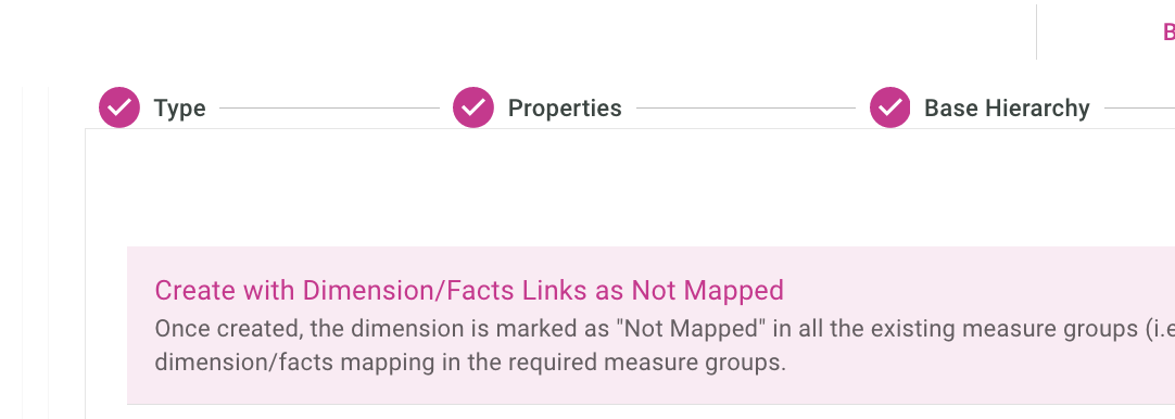
We will keep the link as not mapped. (Let’s worry about this later).
Important, we’ll also make this our default time dimension, so roll up can be computed properly with defaults.
We usually do not load the dimension directly from the fact table, meaning we have a separate really small file, or in memory file that gives us countries, continent etc..
With just one file, it’s easier to just load every thing from the same CSV file.
We are done with the dimension setup in the context of this post, let’s move on to setting up the measure.
Create Cube and Measures
Simply said, in iccube, measures are three things:
- based on a data source (fact table)
- measures are data computed on top of the source data,
- measures are grouped in Cubes
In this post, we want to have the average of the underlying data, so if we look at the data over a year, we want it to be the average of every month of that year.
To achieve this, we will create a cube
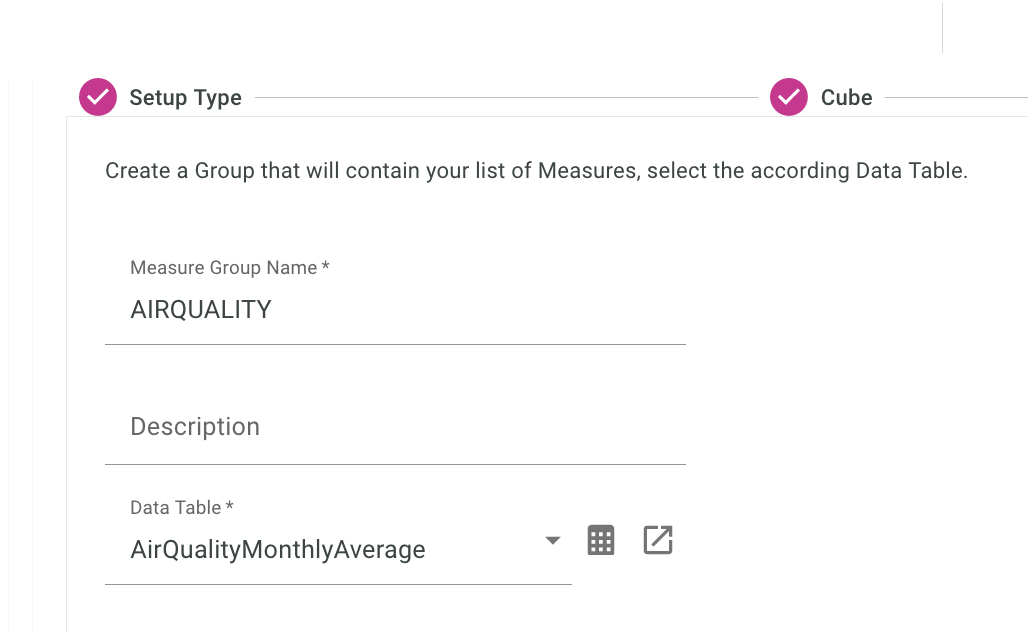
We will create a new cube, and first, give it a name, and the source Data Table for the facts:
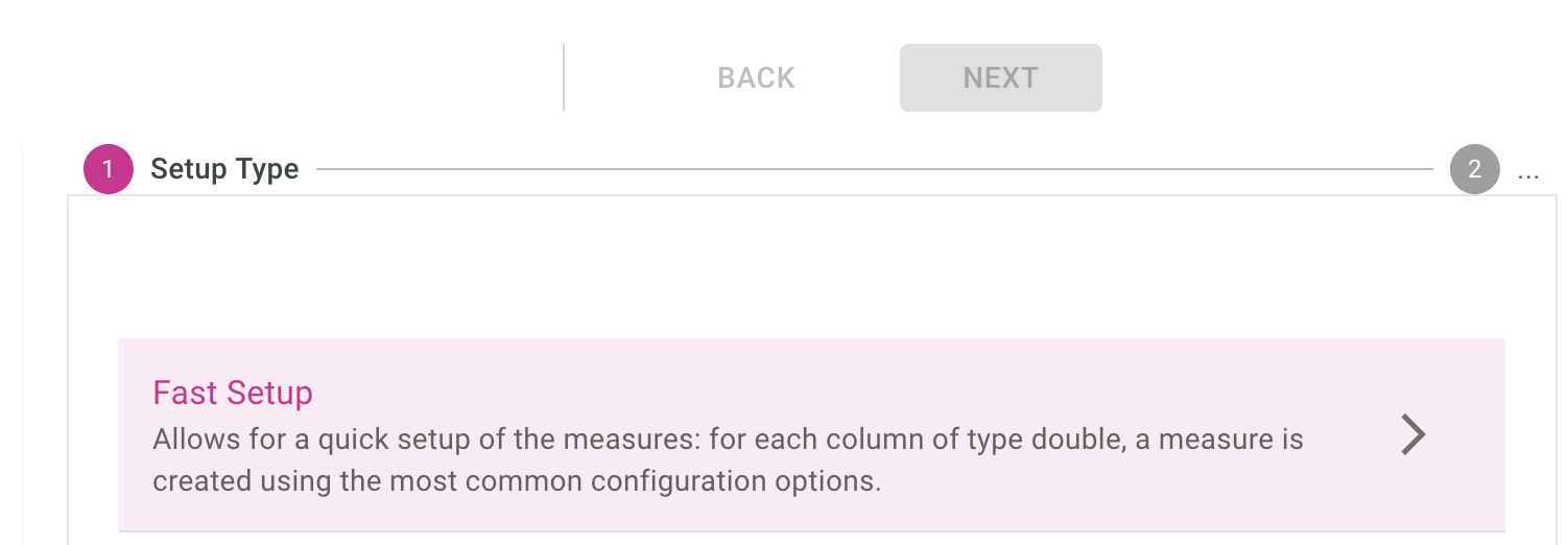
We’ll use the fast setup up as a base, so that IcCube can just pull up columns to use as measures:
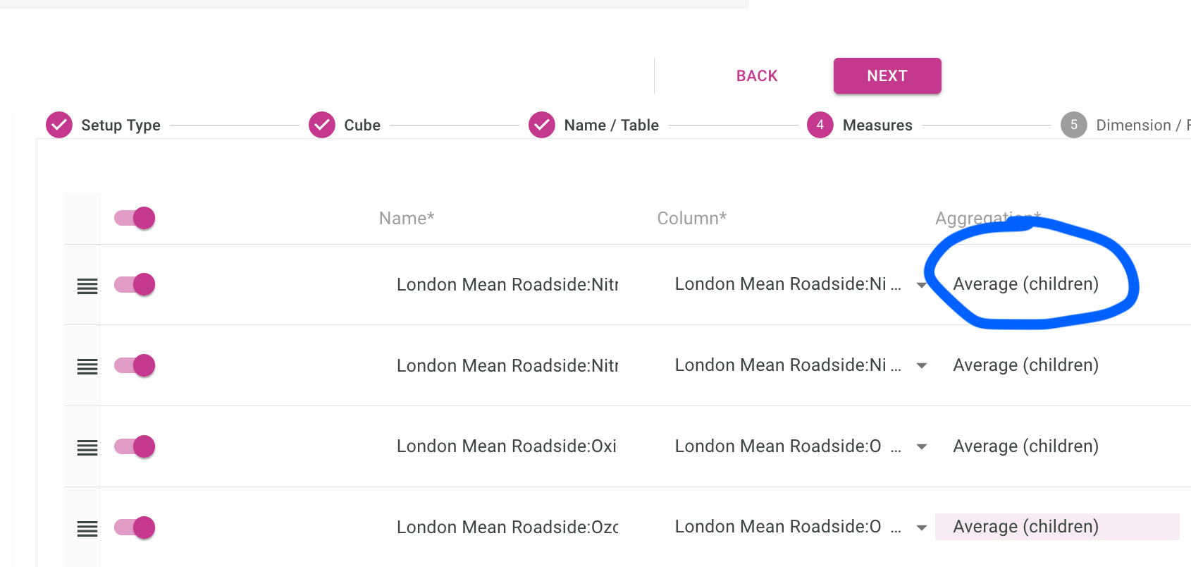
Default slicing policy is to SUM everything, but here we want the average, so let’s set each measure aggregation type to Average (Children):
The mapping below correspond to how you link a line of your data, to the dimension we defined in the previous section.
The raw data in the original CSV file contains Mon-Year on each line, and we will map that to the last level of the dimension which would be the same month-year.
(basically a 1-1 mapping because it’s the same data, ie Jan-08)

To understand thing a bit better, if we go back to the Continent -> Country -> City dimension setup, we could have the City on each line of our (fact) data, but not the Continent and Countries, those would come from the Dimensions, and the extra computation would be done internally by IcCube.
Deploy the schema
This part implies we deploy our cube and data definitions, and this is done by going to Deployment > Deploy & Load.
Deployment loads the schema definition (things we wrote in the IcCube builder), while Load loads the data itself (so data coming from the remote CSV file).
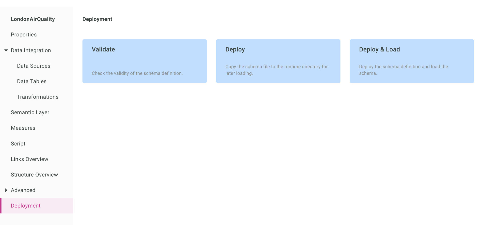
The loading should be finishing rather quickly and display the following message:

if not, go back to the schema definition and check your settings. (or get in touch !)
Let’s head quickly to the MDX (query) console to test our setup.
Play with the MDX console
In the MDX console you can write SQL-like queries to see how the data renders, and check the integrity of the data in the cube before working on your reporting.
Here is a simple query, showing the AirQuality of PM2.5, over the time periods.
select
   [Measures].[London Mean Roadside:PM2.5 Particulate (ug/m3)] on 0,
   [Date].[DATE].[Year] on 1
   from
[London]
And the resulting drillable table:
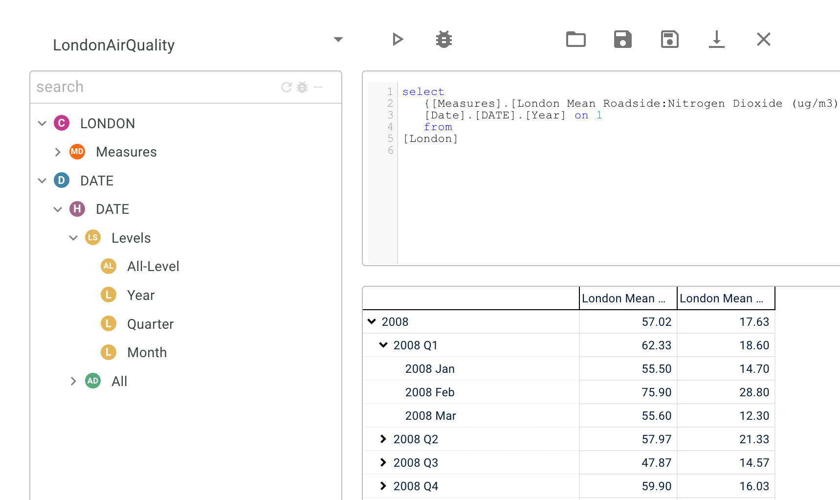
Note you can drag and drop and autocomplete most things in that console, so it’s a simple but powerful tool.
Note also, you can also check the integrity of the data using that drillable view.
All good. Now we can head to the reporting.
Working on the reporting
Report helps give us a focus, and it frames the dialogue for moving forward.
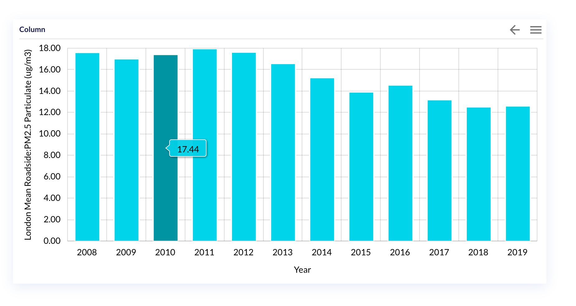
Our dashboard will contain a single widget, with columns of measures of the Roadside PM2.5 over the Date hierarchy.
You would be happy the hardest part was done in the last section, and here is mostly drag and drop ! Let’s do it.
Access the dashboard editor
To access the dashboard editor, follow the two links below:
First the dashboard console:

An application being a set of dashboard, here we just want to create a simple dashboard and so head to the Dashboard editor.
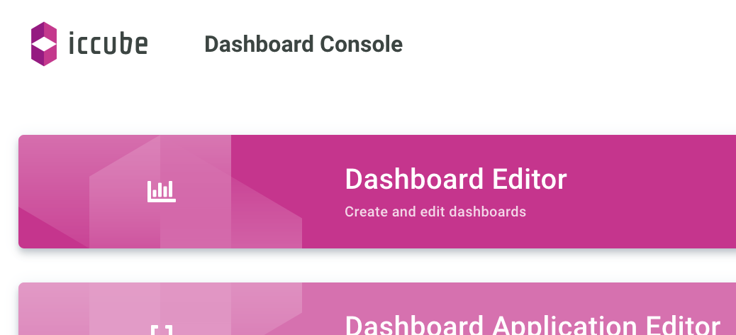
Now let’s get the widgets dancing.
create a new dashboard
We give our dashboard a name, and a target cube.
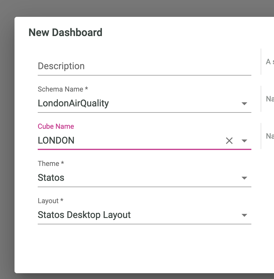
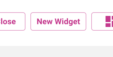
We come up with an empty canvas, let’s quickly add a New Widget with:
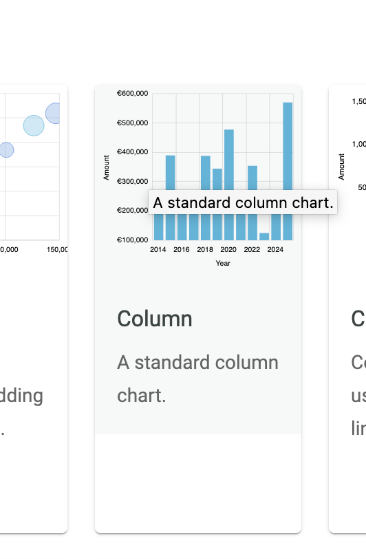
In the gallery, we select the Column chart:
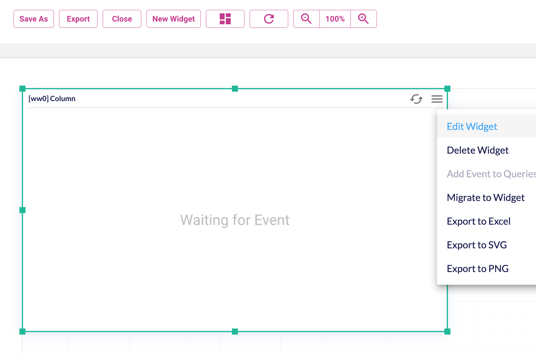
And make its dimension to something we are good with, and click on Edit Widget to feed it with content:
Many settings, so let’s not get distracted. In the query tab, we recognize the dimensions and measures we had in the MDX console. Let’s drag and drop the PM 2.5 measure as the value, and the Year as the Axis.
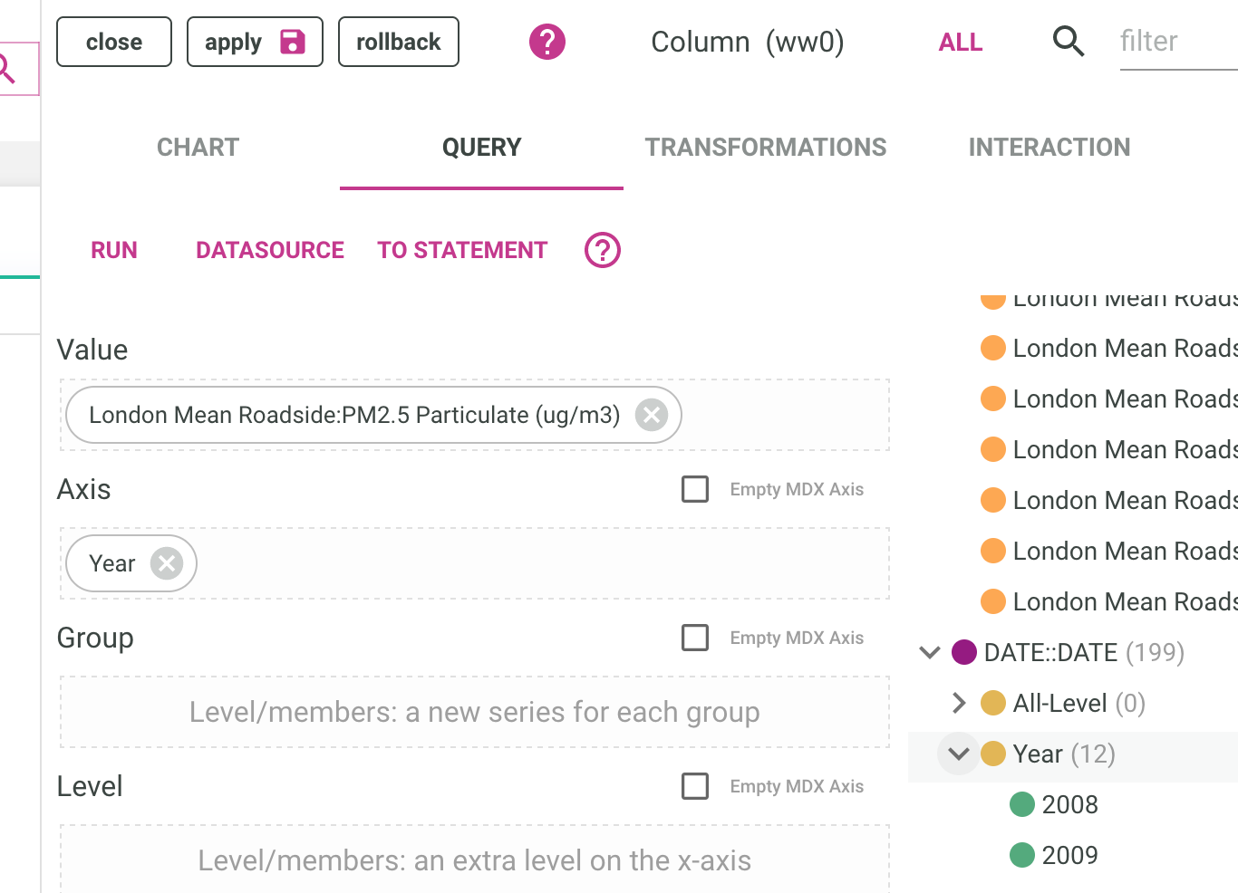
We press Apply to get the settings to the actualy widget.

And the result should now look something like the below:
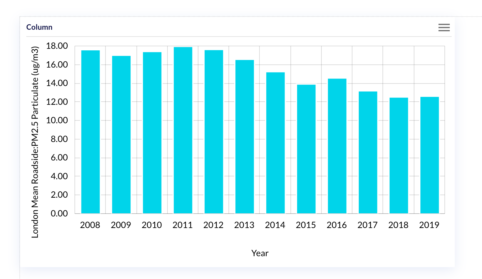
Ah, but wait, no drilling yet, let’s get that in.
add the drill down feature
In the edit widget back again, let’s go to the interaction tab, and enable the drilldown feature.
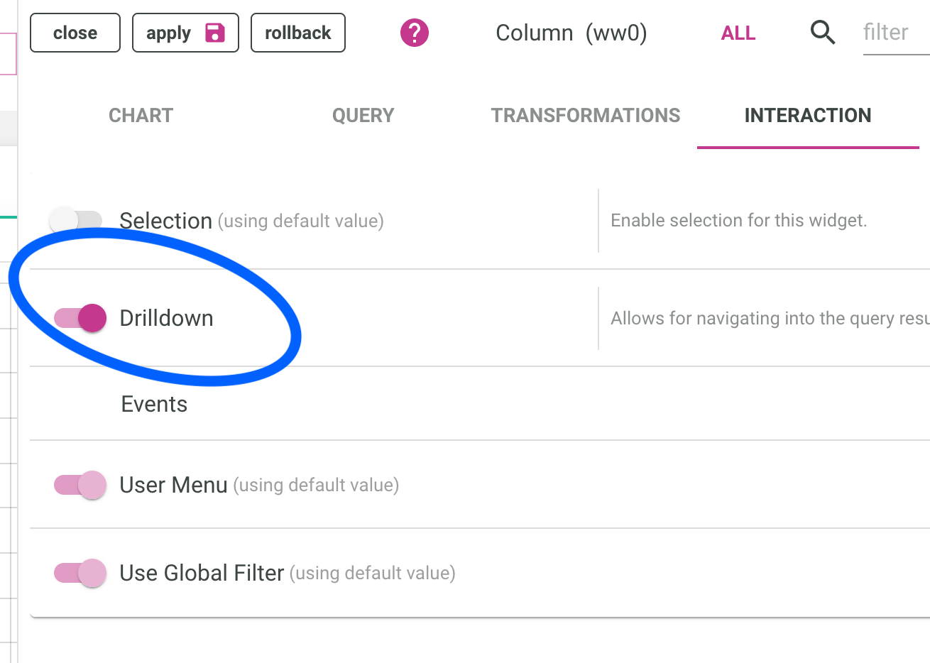
By default, it will go down levels in our hierarchy, so after clicking on a year, we should have quarters, and then months, each of them the average of their children.
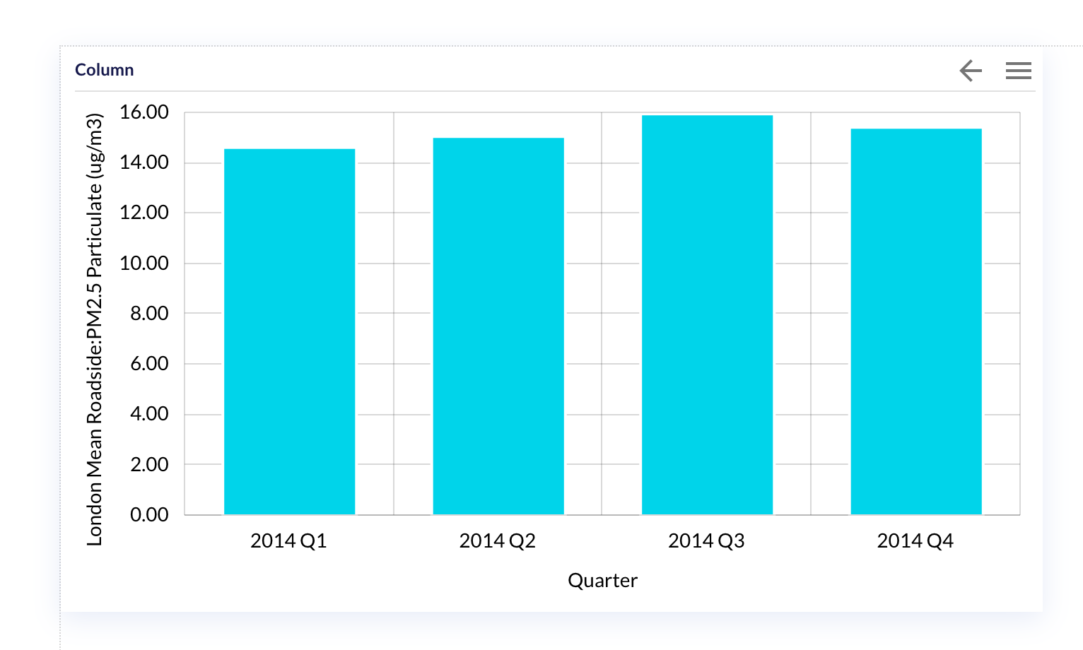
visualize the result
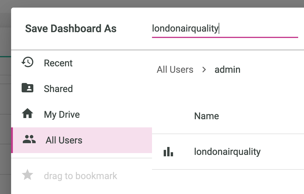
Before seeing the full result stand alone, we need to save the report by pressing the corresponding button:

And give the report a name:
Finally, click on the DashBoard viewer:

Then we can enjoy the full standalone report:
Did you time how long it took to get from scratch to a full report ?
Choose some more csv files as data source, for example the Reservoir levels in London and have fun drilling down !